
Great Nonprofit Logos That Help You Feel the Mission
A curated list of real-world designs that carry meaning, not just style.

“Designers actually can change the world for the better by making the complicated simple and finding beauty in truth.”
— Michael Bierut
As someone who helps organizations clarify and articulate their mission, I believe everything — from programming to partnerships to messaging and beyond — should advance that mission. Including the logo.
A strong mission should communicate what you do, why you do it, and the impact you hope to make. But it’s the impact that matters most. Not all of the organizations featured here have nailed their written mission statements — but these logos get to the heart of the work. They express purpose, emotion, and meaning — sometimes more clearly than the mission statement itself.
While plenty of lists highlight “beautiful” nonprofit logos, beauty alone isn’t the bar here. I’m looking for logos that marry design and purpose — that help people feel the mission, not just recognize the brand.
Frank Lloyd Wright once revised his mentor’s famous phrase, saying: “Form and function are one.” That’s the idea behind this list. These logos don’t just look amazing — they work. They carry meaning, stir emotion, and reflect purpose with clarity and conviction.
Just
“We offer support and nurturing homes to people with mental health issues, learning difficulties and a background of homelessness. Our aim is to enhance the potential of both our customers and our staff. We empower everyone to achieve what they want to achieve. Genuine respect for others and excitement at seeing people step up to the challenge (whatever the size) play a massive part in our daily lives.”
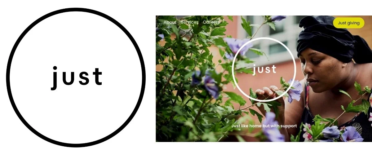
When someone is in crisis, even small tasks can feel overwhelming. Based in London, Just offers the support, safety, and space people need not just to survive, but to truly live. It’s a simple idea with a powerful impact.
Designed by Pentagram, Just’s logo reflects this sense of clarity and calm. The name — placed plainly within a soft, open circle — has room to breathe. It evokes a feeling of safety, containment, and dignity. There’s no excess, no distraction. Just space, order, and presence. It’s a visual embodiment of what the organization provides: groundedness, balance, and a chance to feel centered in your own life.
Elegant. Minimal. Mission-forward.
Design by Pentagram (London). Lead designer: Marina Willer.
Musicians On Call
“Mission: Musicians On Call brings live and recorded music to the bedsides of patients, family members, and caregivers in healthcare environments.
Vision: A world filled with the healing power of music.”

Science has now proven what musicians and music lovers have always known: music doesn’t just lift your mood — it can help heal the body. It reduces stress, improves mental health, and even speeds recovery. The Kennedy Center had even partnered with the National Institutes of Health to explore the science of music and health — work that was derailed following the politically motivated takeover. (For a great research, read Music and Mind, edited by Renée Fleming.)
Of course, doctors can’t write prescriptions for live music — and that’s where Musicians On Call comes in, bringing it directly to the bedside.
Their logo may appear straightforward, but it’s doing a lot in a small space. It blends two powerful symbols — a guitar and a stethoscope — into a single, unified icon. It’s a literal fusion of music and medicine, and it works because it’s emotionally intuitive. The image immediately signals what the organization does, but it also communicates something deeper: that healing doesn’t have to feel clinical. With its soft lines and friendly type, the logo is warm and approachable — just like the musicians who show up with a song instead of a syringe.
It’s a great example of a logo that doesn’t just tell you what they do. It helps you feel why they do it.
Design by Teal.
Girls First Fund
“The Girls First Fund supports community-based organizations working to end child marriage and advance the rights and well-being of girls.”

Every year, an estimated 15 million girls are married before the age of 18 — across countries, cultures, religions, and ethnicities. This practice limits opportunity, threatens health, and violates the basic rights of girls around the world. Girls First Fund exists to change that reality by supporting grassroots organizations working within their own communities to lead long-term, cultural change.
This is a logo that holds both tenderness and strength. A young girl’s profile is seamlessly intertwined with a bird in flight — a symbol of freedom. Her gaze is lifted upward, her profile framed by wings, evoking motion, hope, and a future that belongs to her.
Designed by Push10, the logo’s overlapping lines don’t just look cool — they reflect the reality of the work. Ending child marriage isn’t simple, and the solutions aren’t one-size-fits-all. The Girls First Fund supports efforts that are rooted in community, led by people who know the culture, and shaped by local wisdom. The result is a mark that doesn’t just represent the mission — it feels like it’s part of it. Protective. Hopeful. Forward-looking.
Design by Push10.
Peace Corps
“To promote world peace and friendship by fulfilling three goals: helping the people of interested countries in meeting their need for trained men and women; helping promote a better understanding of Americans on the part of the peoples served; and helping promote a better understanding of other peoples on the part of Americans.”

Reminiscent of Barack Obama’s acclaimed campaign logo designed for the 2008 election, the Peace Corps’ updated identity is a modern evolution of its original mark. Grounded in the colors and stripes of the American flag, it echoes Obama’s tone of optimism and shared possibility.
At the center is the dove — a universal symbol of peace — emerging from the white stripes themselves, as if lifted by the ideals the organization seeks to carry around the world. It’s a visual metaphor for service and diplomacy: the American spirit extended not through dominance, but through listening, learning, and talking (crazy, I know)..
Design by the Peace Corps in collaboration with Forum One and Ogilvy Washington.
Alzheimer Nederland
““We must prevent, treat, or cure dementia. Until then, we are committed to improving the quality of life for people with dementia and those around them. To reach this goal, we fund scientific research, provide information to reduce risk, report on the needs of patients and caregivers, push for better care, and offer direct support.””

This one hits me right in the feels. I’m currently watching this cruel disease take over my mother’s life — not just her memory, but her presence, her understanding of the world, her sense of self. And what this logo does — more effectively than almost any I’ve seen — is build empathy and understanding. It helps people grasp not just what dementia is, but what it feels like from the inside.
It starts with a structured sans serif font — sturdy and grounded, like a full, coherent life. Then the blur creeps in. It softens the edges, invades the negative space, and begins to erode the form. The text becomes harder to read, but not unreadable. The identity is still there, but slipping away. It’s a visual metaphor for how dementia gradually steals comprehension and dignity — leaving only a silhouette of the person behind.
And still, even through distortion, the form remains. You can see who they were — if you look hard enough.
I’ve had other close family members suffer and die from Alzheimer’s and other cognitive impairments. When those final years are your last memories, it’s easy for that to become the story you carry forward. Alzheimer Nederland’s visual identity pushes against that. It reminds us to look past the disease — and to remember how they lived, not just how they died.
Design by Studio Dumbar/DEPT®.
Historic Houses
“Historic Houses is a cooperative association of over a thousand independently owned and operated historic houses, castles, and gardens across the UK — most of them still lived in today. These are not just architectural treasures, but evolving, working places that serve communities, preserve culture, and support the economy. Their owners are stewards, storytellers, and advocates, working to keep these places alive and accessible for generations to come.”

The visual challenge here is one I’ve spent a lot of time thinking about: How do you create a logo for an organization that speaks not to one house, one style, or one era — but to hundreds of them, spanning centuries of architectural design? How do you capture that diversity without defaulting to a single, iconic form?
Johnson Banks solved it with subtle brilliance. The symbol combines three distinct house forms — each suggesting a different size and period — with one hiding entirely in negative space. It’s a smart way to represent architectural diversity without visual clutter or favoritism. The result is clean, balanced, and deeply respectful of the organization’s purpose: to elevate and support all of Britain’s independent Historic Houses.
Design by Johnson Banks.
Hillary for America
“Americans don’t say ‘I alone can fix it.’ We say, ‘we’ll fix it together.’”

Presidential campaigns aren’t nonprofits in the traditional sense, but they are among the most mission-driven endeavors out there. And while Hillary Clinton’s 2016 campaign didn’t end in a win — an outcome with profound and devastating consequences for the country and the world — I refuse to blame the logo designers.
Because the logo? It was excellent.
Designed by Michael Bierut of Pentagram, alongside Jennifer Kinon (now co-founder of Champions Design) and Jesse Reed (now co-founder of Order, but part of Bierut’s team at the time), the identity was striking in its simplicity. A bold blue “H” crossed by a forward-pointing red arrow, it sparked early criticism for being too plain — but that minimalism was its power. The boldness, adaptability, and clarity made it one of the most effective political logos in modern memory.
The arrow wasn’t just directional — it was purposeful. It suggested forward movement, momentum, and a connected future. It bridged the pillars of the “H” just as the campaign’s slogan, Stronger Together, sought to bridge divisions across the country. And in use, it became a fully flexible system — adapted across causes, colors, textures, constituencies, and events with stunning consistency.
Of course, Barack Obama’s 2008 campaign had already set the bar for modern political design — proving that a clear, compelling visual identity could shape public perception and energize a movement. Hillary’s campaign built on that foundation, with a logo system that was less romantic but more flexible — practical, tactical, and scalable across every digital and grassroots touchpoint.
In a political climate where so many things were — and continue to be — twisted, misunderstood, or attacked out of context, this logo held its ground. It did exactly what it was designed to do: create a unified visual platform for a candidacy built on progress, inclusion, and action.
Design by Michael Bierut (Pentagram), Jennifer Kinon (Champions Design), and Jesse Reed (Order).
San Francisco Symphony
““The San Francisco Symphony exists to inspire and serve audiences and communities throughout the Bay Area and the world through the power of musical performance. Innovation is a central theme of its artistic vision and programming initiatives. The Symphony continues to build on the meaningful qualities of the art form while introducing new opportunities for enrichment and engagement among all audiences.””

Classical music has long carried a perception problem — seen as exclusive, stuffy, white, and old. The San Francisco Symphony is actively working to change that. Under the leadership of conductor and composer Esa–Pekka Salonen and artistic collaborators from across genres and disciplines, they’re rethinking what a symphony can be — not just musically, but structurally, culturally, and visually.
What I love about this logo system is that it doesn’t try to modernize classical music by ignoring history. Instead, it honors the tradition and then lets it evolve. The typography starts with a classical serif base, then magically responds to sound. Each character stretches and shifts with the music — literally shaped by it.
It’s a visual metaphor that actually feels like symphonic music: elegant, emotional, and alive. The black-and-white palette keeps things grounded in formality, but subtle colors used across their executions are inspired by the Bay Area landscape and adda sense of place. It’s both grounded, progressive, and exciting — exactly like the culture they’re working to build.
Design by COLLINS, in collaboration with the San Francisco Symphony.
Form Follows Mission
A strong logo can make you feel something — but the best ones help you understand something, too. They’re not just beautiful marks. They’re at the intersection of purpose, impact, and identity. At their best, they communicate what an organization stands for before a single word is read.
That’s why I believe mission has to come first. Not just as a statement on a website, but as a foundation that guides design, voice, and how you show up in the world. Whether you’re an emerging nonprofit or a legacy institution, this kind of clarity is powerful — and too often overlooked.
To Be Continued...
I didn’t set out to make a definitive list — so this isn’t one. There are so many other logos that deserve a spotlight, and more will be added here over time as I discover new ones and as projects I’m working on come to life.
If you know a nonprofit logo that helps you feel the mission — whether you designed it, commissioned it, or just admire it — I’d love to hear about it. Drop it in the comments with a name or a link, and let’s keep the conversation going.
A Little Gratitude
This post wouldn’t be what it is without the insight and suggestions I received from a few trusted designer friends. Some of their logo picks appear here, others pointed me toward new discoveries, but all of them helped me think more clearly about how mission and design intersect.
Big thanks to Brienna Flewelling (freelance work), Jesse Reed and Garrett Corcoran from order, Shawn Hardy of Smitten Labs, and Luis Medina of Noble Candy for generously sharing their time and thinking.

Jeff Goodman is a nonprofit consultant specializing in helping arts organizations clarify their mission and amplify their impact. A former professional actor, he brings a creative approach to his consulting, enabling organizations to tell compelling stories that resonate with audiences and build lasting support. His signature program, Mission Critical, emphasizes collaboration and is dedicated to making the arts accessible, engaging, and exciting for all.
